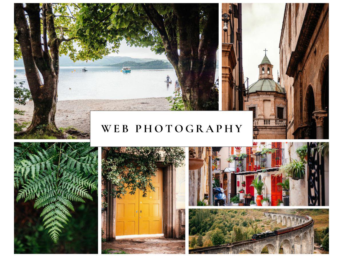
What Is Web Photography? A Practical Guide To Images That Make Your Website Faster, Clearer, And More Trustworthy
A practical guide to web photography, covering how to shoot, size, compress, and publish images that look professional and load quickly.
- 8 min read
Web photography is photography created specifically for use on websites, optimized to look great on screens, load fast, and support your brand and business goals. Unlike general or print photography, web photography is designed with digital layouts, responsive cropping, and file size in mind, so your site feels modern and professional on any device.
In this guide you’ll learn:
- What web photography actually is
- Practical tips for taking photos that work on websites
- The best formats and image sizes for common page sections
- How to compress images for web without destroying quality
- Basic implementation tips like responsive images, lazy loading, and alt text
What Is Web Photography?
Web photography, also called website photography or branding photography for the web, is any imagery created to represent your brand, products, or services online. It includes hero images, product photos, portraits, lifestyle shots, and backgrounds tailored for digital screens rather than print.
Key differences vs general or print photography:
- Output medium: Web images are viewed on screens, not paper, so they use screen resolutions and the sRGB color space instead of print-focused CMYK.
- Performance constraints: Files must be light enough to load quickly and pass performance audits like Google Lighthouse and Core Web Vitals.
- Responsive layouts: Photos must survive being cropped and resized across desktop, tablet, and mobile layouts without hiding the important subject.
Done well, web photography boosts first impressions, increases time on page, and supports conversions by making your site feel clear, trustworthy, and aligned with your brand.
Why Good Website Photography Matters
High-quality, relevant images are one of the most influential elements on a website, often more persuasive than copy alone.
Strong website photography can:
- Build trust and professionalism: Sharp, consistent images signal that your brand is credible and established.
- Support your messaging: Photos that reflect your real services, locations, or team help visitors quickly understand what you offer.
- Improve engagement and conversions: Clear imagery keeps people browsing longer and makes calls-to-action more compelling, which can translate into more leads or bookings.
Poor-quality or slow-loading images can make a site feel dated, harm SEO, and cause users to leave before they read anything.
Photography For Websites: Practical Tips
You do not need a studio and a full-frame camera to create good web photos. Modern smartphones are often enough if you follow a few simple rules.
Plan Before You Shoot
- Define where each photo will be used: hero banner, product grid, blog post, about page, and so on.
- Decide the orientation: most website sections prefer landscape images, especially for hero areas and banners.
- Remove clutter from the background so the subject stands out and cropping or text overlays are easier.
Compose For Responsive Layouts
- Keep the main subject in a safe zone near the center or slightly off-center, so it does not get cropped away on mobile.
- Leave some negative space where headings or buttons can sit on top of the image, such as sky, wall, or blurred background.
- Shoot multiple variations, including tight, medium, and wide frames, so your theme can choose the best fit.
Use Good Lighting And Focus
- Prefer soft natural light, such as window light or golden hour, rather than harsh direct sun or dim indoor lighting.
- Make sure the subject is in sharp focus because blur and noise become more noticeable after compression and resizing.
Consistency in lighting, color, and overall style across your site images helps create a strong, recognizable visual identity.
Choosing The Best Image Formats For The Web
Using the right format for each type of image is one of the biggest wins in web optimization.
- JPEG or WebP or AVIF: Best for photographs and complex scenes such as hero images, travel shots, and galleries. They offer good quality at relatively small file sizes.
- PNG: Use when you need transparency or crisp edges for UI icons, diagrams, and screenshots. PNG is lossless but often larger, so use it sparingly.
- WebP or AVIF: Modern formats that can achieve dramatically smaller file sizes than JPEG and PNG at similar perceived quality. Many optimization tools can convert your images automatically.
- SVG: Ideal for logos, icons, and simple vector graphics. SVGs stay sharp at any size and are usually very lightweight.
When possible, deliver WebP or AVIF to supported browsers and fall back to JPEG or PNG for older browsers.
Best Image Sizes For Website Photography
There is no single best size because responsive websites serve different sizes to different devices. Still, there are reliable ranges that work well in most layouts.
Recommended Dimensions By Image Type
| Image type | Typical desktop size (W x H) | Typical mobile size (W x H) | Common aspect ratios |
|---|---|---|---|
| Full-width background | 1920-2560 x 1080-1400 px | 360 x 640 px | 16:9 |
| Hero or banner | 1280-1920 x 600-900 px | 360 x 200-300 px | 16:9 or 3:1 |
| Blog or content image | 1200 x 630-800 px | 360 x 240-260 px | 3:2 or 4:3 |
| Product or thumbnail | 150-400 x 150-400 px | similar or slightly smaller | 1:1 |
| Rectangular logo | 250-400 x 100-150 px | 160 x 40 px | 4:1 or 3:2 |
| Square logo or icon | 100 x 100 px | 60 x 60 px | 1:1 |
These ranges align with what many modern ecommerce and website platforms recommend: large desktop banners at or above 1920 px width, content images around 1200 px, and small UI assets kept compact.
Target File Sizes
Exact numbers vary by design and audience, but most performance-focused guides recommend keeping files as light as possible without obvious quality loss.
As a rule of thumb:
- Thumbnails and small UI images: Aim well under 50 to 80 KB each.
- Standard blog or content images: Try to stay roughly in the 80 to 200 KB range when compressed.
- Large hero or background images: These may be larger, but they should still be carefully compressed and tested, ideally a few hundred KB rather than megabytes.
Modern compressors and formats like WebP and AVIF can often reduce file sizes by 60 to 85 percent compared with unoptimized JPEG or PNG, with minimal visible difference.
How To Compress Images For Web
If your source images come straight from a camera or phone, they are usually far too large for direct upload. Follow this workflow to compress them while keeping them sharp.
1. Resize To The Correct Dimensions
Before compressing, resize the image to roughly the maximum size it will ever appear on your site. For example, if your hero image area is 1920 px wide, there is no need to upload a 6000 px wide file.
You can resize using:
- Desktop tools like Photoshop, Affinity Photo, or GIMP
- Online editors
- Built-in image tools in your CMS
2. Choose The Right Format
Pick JPEG, WebP, or AVIF for photos, PNG for graphics with transparency, and SVG for logos and icons.
3. Apply Compression
Use an image compression tool such as TinyPNG, TinyJPG, or similar services to reduce file size further.
- For JPEG or WebP, start with a medium-high quality setting and preview the result.
- Watch for blocky artifacts, color banding, or unreadable text. If that happens, bump the quality slightly.
4. Convert To Modern Formats
Where possible, convert your final assets to WebP or AVIF for an additional size reduction. Many CDNs, optimization plugins, and build pipelines can handle this automatically.
5. Upload And Test
After upload:
- Check the image on desktop and mobile for sharpness and cropping.
- Test page performance with tools like Google Lighthouse or PageSpeed Insights to see if you still get warnings such as properly sized images or next-gen formats.
Making Images Responsive: Basic HTML Pattern
Responsive images allow the browser to choose an appropriately sized file for each screen, which saves bandwidth and improves load times.
<img
  src="image-640.jpg"
  srcset="
    image-640.jpg 640w,
    image-1280.jpg 1280w,
    image-1920.jpg 1920w,
    image-2560.jpg 2560w
  "
  sizes="(max-width: 640px) 100vw, (max-width: 1024px) 100vw, 1200px"
  alt="Describe the image briefly"
>
srcsetlists available image widths.sizestells the browser how wide the image will render in different viewport ranges, so it can pick the best file.
If you use a modern CMS or page builder, many responsive-image details can be handled automatically once you upload multiple sizes.
Performance, Core Web Vitals, And Lazy Loading
Images heavily influence Core Web Vitals, especially Largest Contentful Paint and Cumulative Layout Shift.
To keep your site fast:
- Optimize your largest images first: Usually hero images, sliders, and key product photos above the fold.
- Use lazy loading for images lower on the page so they only load when the user scrolls near them.
- Set width and height or aspect-ratio so the browser reserves space and avoids layout shifts while images load.
Regularly re-test pages after adding new images to catch regressions early.
Accessibility And Alt Text
Good alt text is part of both accessibility and SEO.
Basic guidelines:
- Describe the purpose of the image in context, not every tiny detail.
- Example: “Snow-covered mountain landscape near Reykjavik at sunrise” rather than “Photo 1234”.
- Include keywords only when natural because alt text is for humans using screen readers first.
- Mark purely decorative images so assistive technologies can skip them.
Alt text also gives search engines more context about your content, which can improve image search visibility.
Quick Checklist
Before you publish, run through this simple checklist:
- Relevance: Every photo supports the page’s goal and content, not just filling space.
- Composition: The subject is clear, the background is tidy, and there is room for cropping and text overlays.
- Consistency: Style, color, and editing feel unified across the site, reinforcing your brand identity.
- Correct dimensions: Images are sized appropriately for their sections such as hero, content, thumbnails, and logos.
- Optimized format: The chosen format matches the image type.
- Compressed files: No gigantic originals. Everything has been resized and compressed with a tool or plugin.
- Responsive loading: Where possible, multiple sizes are provided via your theme, CMS, or
srcset. - Accessibility: Alt text is added and meaningful, and decorative images are marked correctly.
- Performance-tested: The page passes basic Lighthouse or PageSpeed checks for image size and format.
If you follow these principles, your website photography will not only look better but also load faster, rank better, and convert more visitors into customers.